
Showing posts with label Bright. Show all posts
Showing posts with label Bright. Show all posts
Wednesday, March 1, 2017
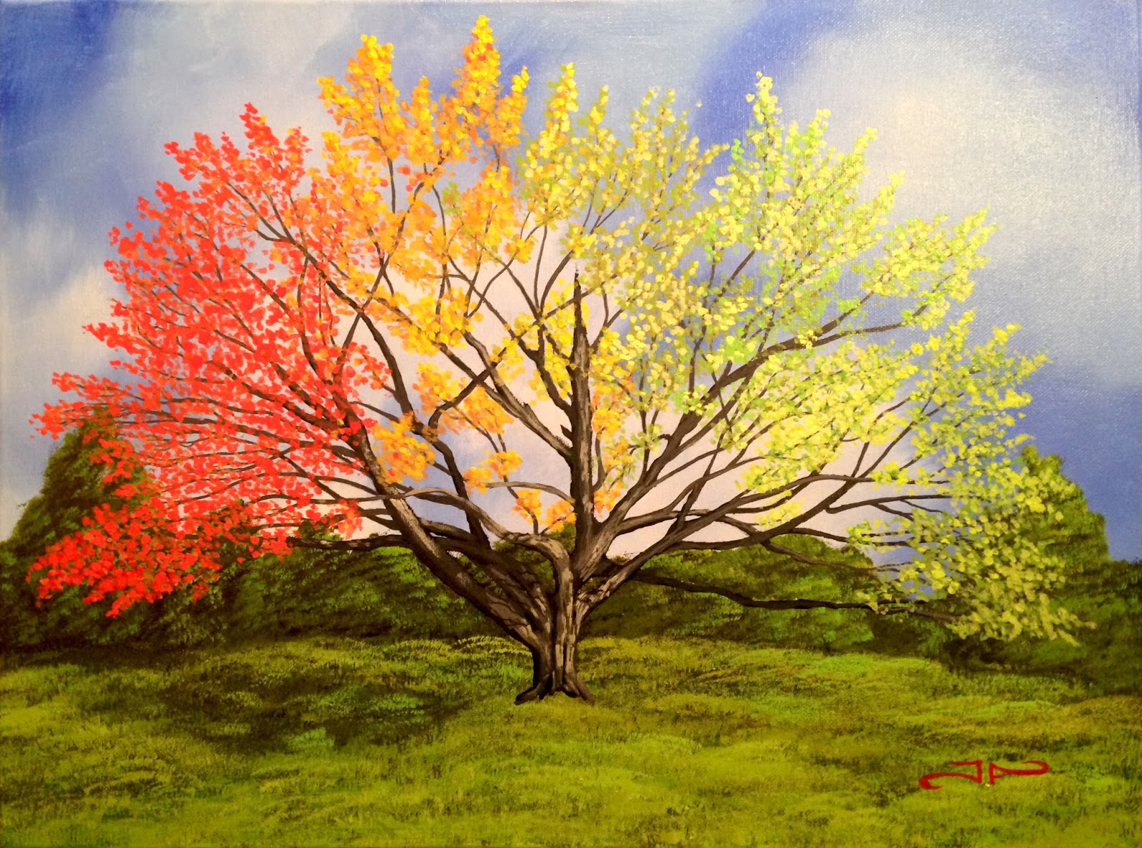
18" x 24" Acrylic on Canvas
All was going pretty well until the first glitch hit and my phone stopped recording. I lost a lot of the sky work to the gremlins and came back to it with this idea that I was done with the sky when I wasn't.
All in all it is what it is and I had a blast doing it. I think it came out great and I hope to be making something new as soon as possible.

Thursday, October 27, 2016
“Pumpkin Pile”


Just in time for fall I offer you my latest piece of art. This drawing/painting is a pile of pumpkins from my own reference that would look great on your wall.
This Color Pencil piece was made using (25+ year old) Prismacolor pencils… you know, when they were still good pencils, and blended with Mona Lisa odorless paint thinner. (a la Lachri)
I started by sketching out my subjects loosely but maybe a bit too much pressure, this was my first attempt with these materials and this was definitely a learning experience for me.
Then I added a single layer of my base orange colors with a little red orange thrown in for depth.
After this I blended the entire thing out to soften the look and really get that color onto the paper and into all that tooth, even though it was fairly smooth paper.

Then I blended that out as well.
I then went in for a fourth and fifth layer that will not be blended softly. And give it those little details that finished it up.

After that I added where my highlights would be in a yellow orange and added some browns to where the shadowing was.
I hope you like the finished product and prints will be made available soon through Fine Art America and directly from Facebook.
Thanks for stopping by.
Joseph
Sunday, April 3, 2016

"First Light"
18" x 24" Acrylic on Canvas
Available for purchase
$250.00
I always start with my title. I know that many others go the opposite direction in this, but for me, this is what works best. I thought about it for a day or two and came up with the title...
"First Light"
Once I had the title, I began thinking about what elements I would like to add.
The challenge called for something astronomical (stars, planets etc) and since I have always loved pictures of space, I immediately thought of the Milky Way as viewed from Earth, which I should add, I have never lived or even been somewhere where this is visible to the naked eye. I have however seen pictures of this thousands of times and I knew what it looked like. I also love the look of the full moon so I figured both should be included.
The second thing was something that swims, and my first thought was sharks, but that seemed to aggressive for what I was seeing in my minds eye. I gave it some more thought and eventually settled on dolphins and/or whales.
The third thing was something that flies. Since my title was first light, I first thought of something that would glow, but then pondered the idea of the phoenix and its inherent concept of rebirth. This is what lead me to the concept of the moon as the egg the phoenix was breaking free of.
I had been contemplating the idea of painting Undulatus asperatus clouds (clouds that look like the underside of ocean waves) and this I thought could add a new dimension to the painting. I could have the dolphins and whales swimming in these clouds.
"First Light"
Once I had the title, I began thinking about what elements I would like to add.
The challenge called for something astronomical (stars, planets etc) and since I have always loved pictures of space, I immediately thought of the Milky Way as viewed from Earth, which I should add, I have never lived or even been somewhere where this is visible to the naked eye. I have however seen pictures of this thousands of times and I knew what it looked like. I also love the look of the full moon so I figured both should be included.
 |
| Initial sketch |
The second thing was something that swims, and my first thought was sharks, but that seemed to aggressive for what I was seeing in my minds eye. I gave it some more thought and eventually settled on dolphins and/or whales.
The third thing was something that flies. Since my title was first light, I first thought of something that would glow, but then pondered the idea of the phoenix and its inherent concept of rebirth. This is what lead me to the concept of the moon as the egg the phoenix was breaking free of.
I had been contemplating the idea of painting Undulatus asperatus clouds (clouds that look like the underside of ocean waves) and this I thought could add a new dimension to the painting. I could have the dolphins and whales swimming in these clouds.
Now since I am mainly a landscape artist I knew I wanted elements of a landscape in it and a mountain could also be a choppy wave so those two concepts merged.
Playing off the light concept in my title is what lead me to the thought of the mountain ridge silhouette. I played with the idea of having a small boy or girl pointing up at the moon and phoenix but it seemed a bit too much. So I scrapped that idea entirely.
So now I had my pieces and all my ideas on a pad so it was time to sketch something up.

Sunday, November 22, 2015
"Autumn Twins"
"Autumn Twins"
TIME LAPSE VIDEO
Saturday, February 14, 2015
Work In Progress
 |
| "Rolling" with the failed background. |
I
eventually put it aside and moved on to another project, always with the hope that someday I would eventually come back to it and get the painting I wanted out of this attempt. That didn't happen... until now.
 |
| "Rolling" with the reworked backgrounds first layer. |
I
finally decided what I wanted to do with it and have started to rework the
failed background. I have decided to go with a much brighter and warmer
background and this is the first layer of color that will go over this old
background, one more should cover all the old background and really add some
more dimension and overall appeal to the entire thing.
Keep an eye out for further WIP images of this one. I think it is going to be a beauty.
Keep an eye out for further WIP images of this one. I think it is going to be a beauty.
Monday, February 9, 2015
"Humming Dolphin"

11 x 15" Watercolor
Having joined a group over on Facebook for artists, I have been having some really great conversations and getting lots of ideas
This group also does a monthly challenge. This months challenge was to combine two things into one, to make an amalgamation.
Mine is a Humming Dolphin, half hummingbird, and half Dolphin. But I couldn't stop there, I also combined a sea anemone and a flower, as well as the sky and the water. Three amalgamations in one watercolor painting
I hope you like it.
Wednesday, November 26, 2014
Tiger Lily Abstracted
 |
| Background roughed in |
 |
| Lily blocked in |
 |
| Minor details applied |
In the fourth image I Brightened the center stripes and add even more highlight detail to make the petals pop a little more from the background orange as I thought that they were falling into this area of being hard to identify.
 |
| More detailing and highlights |
I hope you like it and look forward to reading anything you might have to say about it. Enjoy.
 |
| Final finished product "Tiger Lily Abstracted" by Joseph Finchum |
"TIGER LILY ABSTRACTED"
24" x 18" Acrylic on Canvas Painting
Available for purchase $225
Prints will be made available at a later date.
This is a 16" x 12" Acrylic painting that is brand new.
Painting is a Tiger Lily on an complimentary abstracted background.
Wednesday, November 12, 2014
Floating Through the Seasons - Time Lapse Video
"FLOATING THROUGH THE SEASONS"
TIME LAPSE VIDEO
This is a timelapse video I made of the crafting of this painting. I hope you enjoy seeing the process I use in my paintings and can appreciate the time it takes to make something like this.
Open in YouTube from inside video for best Quality


Friday, November 7, 2014
"Floating Through the Seasons"
 |
| Floating through the Seasons by Joseph Finchum |
"FLOATING THROUGH THE SEASONS"
2 X 24" x 18" Acrylic on Canvas Painting
Available for purchase $500
Prints will be made available at a later date.
This is a 2 x 24" x 18" Acrylic painting that is brand new.
Painting is a Surreal Landscape that depicts floating islands as they travel aimlessly through the seasonal changes, starting and ending with warm Autumn colors.
Painting is a Surreal Landscape that depicts floating islands as they travel aimlessly through the seasonal changes, starting and ending with warm Autumn colors.
I will be adding a Timelapse video of me making this painting tomorrow or the next day so stay tuned for that as well.
All comments are welcome, any opinion appreciated.
Don't forget that you can SUBSCRIBE to my YouTube Channel
http://www.youtube.com/user/dedjezter100
Follow me on Facebook, Google+, and Twitter
https://www.facebook.com/ArtofJosephFinchum
https://plus.google.com/+DedJezter
https://twitter.com/Dedjezter
As well as seeing my works on Instagram
http://instagram.com/theartofjosephfinchum
Friday, October 31, 2014
Work in Progress
 |
Floating through the Seasons |
Work in Progress
So I have been working on this new painting for about a week now and was wondering what people might think of the progress so far. It is slowly coming together.
I have had a small set back as I was trying to make a timelapse video of the work, and the camera I was using decided to crap out on me and I lost the last 2 hours of work that I filmed. It was all work done after this point (pictured) but mostly detail work. I am hoping to use my phone to continue this, but it will take some time to get it all worked out.
As of right now I have figured out how to set most of it up, Deleted a mass amount of stuff from my phone to make room for footage and am eagerly looking forward to getting back to it.
Hope you like what you see so far and any comments or questions or suggestions are always welcomed.
Don't forget to Share, +1, Like, subscribe to my email newsletter, and YouTube channel
https://www.facebook.com/ArtofJosephFinchum
google.com/
https://twitter.com/Dedjezter
http://instagram.com/theartofjosephfinchum
As of right now I have figured out how to set most of it up, Deleted a mass amount of stuff from my phone to make room for footage and am eagerly looking forward to getting back to it.
Hope you like what you see so far and any comments or questions or suggestions are always welcomed.
Don't forget to Share, +1, Like, subscribe to my email newsletter, and YouTube channel
https://www.facebook.com/ArtofJosephFinchum
google.com/
https://twitter.com/Dedjezter
http://instagram.com/theartofjosephfinchum
Monday, April 14, 2014
Reflective Sunset
 "REFLECTIVE SUNSET"

24" x 18" Oil on Canvas Knife Painting
Available for purchase $150
Prints are
available on Fine
Art America by
following the link in sidebar.
This
is a 24" x 18" oil
painting that is brand new. Knife painting is a delicate and messy approach at first, but a fun way to get different textures and effects out of the paint.
All
comments are welcome, any opinion appreciated.
Tuesday, April 8, 2014
It's Monday on Tuesday
Well
I went to the Art Expo in NYC this weekend and I got to see a lot of really well done, well-crafted artwork. However, I did see a lot of what the heck is that artwork as well, but you know what they say, one man’s art is another man’s junk. There were some pretty talented painters exhibiting there as well as some very technical sculptors and their works were simply impressive.
I got to see Tim Gagnon and his artwork in person and being able to see just what the textures and colors look like to the eye as opposed to seeing it on a color monitor, was very much a benefit to his art. I was also glad to see that he sold a few. I also found it interesting that an artist from Maine was being hosted by a gallery ten minutes from where I live on Long Island. It certainly is a Small world.
A few other artists that caught my attention were GehryWelty, whose Geometric paintings are mathematically accurate to a point that they are in the correct perspective no matter what angle they are viewed from, were very impressive. He is also a cinema artist and has worked on movies like Iron Man, Robocop 2014 and Inception to name a few.
Alexis Silk had some amazing free handed glass sculpture that looked extremely delicate and were hanging from large industrial steel hooks giving that sense of their impending breakage.
Beatrice Vangreel Had some cool looking line art works that had a vibrant green color that could accent a wall very nicely.
I got to see Tim Gagnon and his artwork in person and being able to see just what the textures and colors look like to the eye as opposed to seeing it on a color monitor, was very much a benefit to his art. I was also glad to see that he sold a few. I also found it interesting that an artist from Maine was being hosted by a gallery ten minutes from where I live on Long Island. It certainly is a Small world.
A few other artists that caught my attention were GehryWelty, whose Geometric paintings are mathematically accurate to a point that they are in the correct perspective no matter what angle they are viewed from, were very impressive. He is also a cinema artist and has worked on movies like Iron Man, Robocop 2014 and Inception to name a few.
Alexis Silk had some amazing free handed glass sculpture that looked extremely delicate and were hanging from large industrial steel hooks giving that sense of their impending breakage.
Beatrice Vangreel Had some cool looking line art works that had a vibrant green color that could accent a wall very nicely.
I
was also very happy to see Stan Lee had some work there. He was not in
attendance, which was a bummer, but his paintings were in the presence of many
fine artists.
There were also two other artists whose names I failed to get, bad Joseph. One
had some painted wood pieces that really accented the form and patterns of the
wood grain with bold splashes of color and fine lines, while the other did some
impressive textured paintings that used the application of the paint in a way I
had never seen before and thought was a very interesting technique.
All in all, I would say there were some really talented people there and it was well worth the visit. Maybe I will go again next year, but maybe… just maybe, next year I will be in the show rather than just a patron of the arts.
With that said I am sharing with you a sold painting of my own today. This one sold about a year ago and is actually two paintings on one canvas. I hope you like it. All in all, I would say there were some really talented people there and it was well worth the visit. Maybe I will go again next year, but maybe… just maybe, next year I will be in the show rather than just a patron of the arts.
With that said I am sharing with you a sold painting of my own today. This one sold about a year ago and is actually two paintings on one canvas. I hope you like it.
All in all, I would say there were some really talented people there and it was well worth the visit. Maybe I will go again next year, but maybe… just maybe, next year I will be in the show rather than just a patron of the arts.
With that said I am sharing with you a sold painting of my own today. This one sold about a year ago and is actually two paintings on one canvas. I hope you like it. All in all, I would say there were some really talented people there and it was well worth the visit. Maybe I will go again next year, but maybe… just maybe, next year I will be in the show rather than just a patron of the arts.
With that said I am sharing with you a sold painting of my own today. This one sold about a year ago and is actually two paintings on one canvas. I hope you like it.
 |
| Summers Winter By Joseph Finchum 18" x 32" Oil on Canvas |
"Summers Winter"
18" x 32" Oil on Canvas
Sold
Prints are
available on Fine
Art America by
following the link in sidebar.
This
is a 18" x 32" oil
painting that sold a while back. It depicts a mountain landscape with summer colors on one side and winter colors on the other.
|
Monday, March 31, 2014
Visiting the Past Again
This is another look back in time for me. This painting is another one of my first works. It is titled "Lady with Ribbons" or just "Ribbons."
I did this painting just after getting out of high school in 1993. It was one of the first paintings I ever did that was not just a typical landscape and had elements of the abstract and symbolism involved in it. Time unfortunately, has not been fair to this piece. The whites have all faded into a dull yellow and mix into the yellow of the stained glass effect I was going for. It has bad line work and some connections of the ribbons do not line up to the counterparts on the other side. It was painted using liquid watercolor paints, used like acrylics, since I had no knowledge of what I was really doing. I am a self-taught artist and this was one of those times when I was trying to get the feel of paints and how they worked. I didn't know that these paints were even meant to be used with water or that they would not stand the test of time.
In this painting, I was trying to get a feeling of movement and energy. To show
that I could use my imagination to bring something to life that was only in my
head. To me it represents my first real success with painting as well as my
first real defeat in painting. I say it is a defeat only because my mother has
always been my biggest fan and she didn't like this one. She just didn't feel
it so to speak.
I hope you enjoyed this painting and reading a bit about me and my struggles. After all art can be tormenting to the individual and it is only in overcoming these torments that we can really be free.
What do you think of it? Do you think I should redo it? Should I re-imagine it? I would love to hear from you all. Your opinions and feedback are always appreciated.
Joseph Finchum
 |
| Recreated in Photoshop and Illustrator |
 |
| Original Painting done 21 years ago |
I did this painting just after getting out of high school in 1993. It was one of the first paintings I ever did that was not just a typical landscape and had elements of the abstract and symbolism involved in it. Time unfortunately, has not been fair to this piece. The whites have all faded into a dull yellow and mix into the yellow of the stained glass effect I was going for. It has bad line work and some connections of the ribbons do not line up to the counterparts on the other side. It was painted using liquid watercolor paints, used like acrylics, since I had no knowledge of what I was really doing. I am a self-taught artist and this was one of those times when I was trying to get the feel of paints and how they worked. I didn't know that these paints were even meant to be used with water or that they would not stand the test of time.
It is to me, representative of my
life at the time that I did it. I was trying to go with the flow and the
ribbons were meant to represent that. They flow in and out while twisting
around the figure in a tornado of mixed emotions. The woman represents the fact
that all my friends were out there with their significant others while I
wasn't. Being a bit on the antisocial side I have trouble with relationships
and found myself feeling alone a lot of the time. The stained glass effect was
depicting my rigidness in life. Unwilling to change myself for better or worse
and my inability to put myself out there with my art, something I still
struggle with to this day. But the colorful paints are showing that deep down
inside there is a warm person that is trying to emerge. To break free of the
glass and the ribbons that keeps me locked inside of myself. One day, I will
finally shed these things and move on with my life.
Twenty-one years later I find I still feel these ribbons holding
me in place but they are certainly becoming looser. I am just now truly finding
myself and letting go of the things that have held me back. I often think of revisiting this painting and either doing a recreation using what I have learned over the years, or just re-imagining it all together.
I hope you enjoyed this painting and reading a bit about me and my struggles. After all art can be tormenting to the individual and it is only in overcoming these torments that we can really be free.
What do you think of it? Do you think I should redo it? Should I re-imagine it? I would love to hear from you all. Your opinions and feedback are always appreciated.
Joseph Finchum
Subscribe to:
Posts (Atom)