Saturday, October 29, 2016

No longer FREElance

Freelance isn't free anymore as New York City by a vote of 51-49 becomes the first city in the US to attempt to seal the deal for freelance workers.

The Freelance Isn't Free Act is the first bill passed in the US that will actually give freelance workers a legal right to uphold their contracts and I hope the rest of the US will follow suit. This is a great thing for artists as the client can not just worm their way out of paying for work done, as long as a contract was signed.

"The Freelance Isn't Free Act will make sure all workers can get paid for their work, on-time and in full," said Council Member and lead sponsor Brad Lander.

The bill also establishes a formal mechanism for the director of the Department of Consumer Affairs to enforce the labor rights of freelancers who are stiffed by employers.

While it still needs final signing by Mayor Bill De Blasio, but his staff has said that he is indeed in favor of passing the Bill.

This is long overdue in the US and I hope it gets its final approval as soon as possible.

Thursday, October 27, 2016

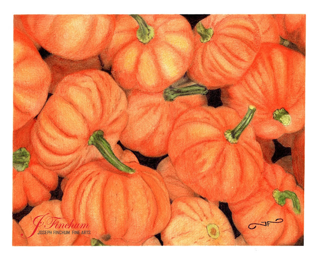
“Pumpkin Pile”


Just in time for fall I offer you my latest piece of art. This drawing/painting is a pile of pumpkins from my own reference that would look great on your wall.

This Color Pencil piece was made using (25+ year old) Prismacolor pencils… you know, when they were still good pencils, and blended with Mona Lisa odorless paint thinner. (a la Lachri)

I started by sketching out my subjects loosely but maybe a bit too much pressure, this was my first attempt with these materials and this was definitely a learning experience for me.

Then I added a single layer of my base orange colors with a little red orange thrown in for depth.

After this I blended the entire thing out to soften the look and really get that color onto the paper and into all that tooth, even though it was fairly smooth paper.
I then went in and added a second and third layer of highlights, shadows, and darks. While also making sure I was getting my lighting right and creating form.
Then I blended that out as well.

I then went in for a fourth and fifth layer that will not be blended softly. And give it those little details that finished it up.
After that I added where my highlights would be in a yellow orange and added some browns to where the shadowing was.

I hope you like the finished product and prints will be made available soon through Fine Art America and directly from Facebook.

Thanks for stopping by.
Joseph


Wednesday, October 12, 2016

The Thinking Behind Thanking

Thank You GIF by Joseph Finchum
        I see a lot of artists on Facebook that post their artwork for others to see and comment on. They do this a lot, and they should, but what I don’t see is artist’s thanking those people who interact for the like or the comment or even for the view… if you know who it is.


     Now the reason to do this is not just to be polite, but to further your reach, being polite is just a side effect of this action. We all know or at least we should all know by now, that Facebook puts some limits on the reach of our posts. If you have 100 followers, Facebook will show that post to about 10 people. If only 1 person out of those 10 interacts with that post, it isn’t going to get out to that many more people after that, if it goes out to any more at all.


     But if you thank that person for their action… you have created another action, one that also reaches out. Friends of that person or rather, people that are not actively following you will see your post with that additional message of “Your Name” was mentioned in a comment or on a post. Now if those friends see your post and act on it in any way… you get a little more action on your post. It is a way of reaching back through your follower to their followers, which in turn can lead to new followers for you and if you are using Facebook for your art… you should.


So send out a thank you now and then and make sure you are tagging the person you are thanking, it can only work in your best interest… In my honest opinion. 

Thursday, June 30, 2016

4TH of JULY SALE


For the first time ever, I am having a sale. Please take a look at the prints I have available for 5% off and the 60" round beach towels that are sizzling hot this summer with free shipping.

Click here for store.

Use Coupon Code : NSMSDD


Sunday, April 3, 2016


 "First Light"

18" x 24" Acrylic on Canvas
Available for purchase
$250.00


I always start with my title. I know that many others go the opposite direction in this, but for me, this is what works best. I thought about it for a day or two and came up with the title...

"First Light"


Once I had the title, I began thinking about what elements I would like to add. 

The challenge called for something astronomical (stars, planets etc) and since I have always loved pictures of space, I immediately thought of the Milky Way as viewed from Earth, which I should add, I have never lived or even been somewhere where this is visible to the naked eye. I have however seen pictures of this thousands of times and I knew what it looked like. I also love the look of the full moon so I figured both should be included.

Initial sketch

The second thing was something that swims, and my first thought was sharks, but that seemed to aggressive for what I was seeing in my minds eye. I gave it some more thought and eventually settled on dolphins and/or whales.

The third thing was something that flies. Since my title was first light, I first thought of something that would glow, but then pondered the idea of the phoenix and its inherent concept of rebirth. This is what lead me to the concept of the moon as the egg the phoenix was breaking free of.

I had been contemplating the idea of painting Undulatus asperatus clouds (clouds that look like the underside of ocean waves) and this I thought could add a new dimension to the painting. I could have the dolphins and whales swimming in these clouds.

Now since I am mainly a landscape artist I knew I wanted elements of a landscape in it and a mountain could also be a choppy wave so those two concepts merged.

Playing off the light concept in my title is what lead me to the thought of the mountain ridge silhouette. I played with the idea of having a small boy or girl pointing up at the moon and phoenix but it seemed a bit too much. So I scrapped that idea entirely.

So now I had my pieces and all my ideas on a pad so it was time to sketch something up.